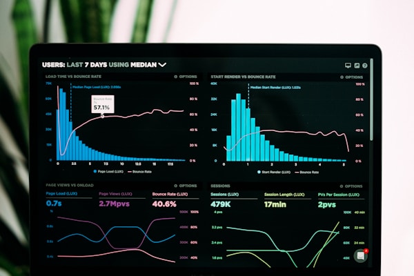
Feature Section
A versatile section component designed to showcase features, benefits, and key information with flexible layouts and responsive design. Perfect for highlighting product features, service offerings, or any content that needs visual emphasis.
Features
- Multiple Layouts: Split, stacked, and centered layouts
- Responsive Design: Adapts beautifully to all screen sizes
- Image Support: Optional images with hover effects
- Flexible Content: Supports any content via slots
- Visual Variants: Default, bordered, and background variants
- Customizable: Easy to style and extend
Basic Usage
import FeatureSection from "@/components/block/FeatureSection.astro"

<FeatureSection
  title="Powerful Documentation Platform"
  tagline="Why choose us"
  description="Build beautiful, fast, and user-friendly documentation sites with our modern toolkit."
  image="/path/to/image.jpg"
  imageAlt="Documentation platform screenshot"
>
  <ul>
    <li>Lightning-fast static generation</li>
    <li>Mobile-first responsive design</li>
    <li>Built-in search functionality</li>
    <li>Customizable themes and components</li>
  </ul>

  <a href="/docs-site-kickstarter/docs/getting-started" class="feature-button">
    Get Started
  </a>
</FeatureSection>
Examples
Split Layout (Default)
Modern Documentation Made Simple
Create beautiful documentation sites with our comprehensive toolkit. Everything you need to build, deploy, and maintain professional documentation.
- Component-based architecture
- TypeScript support out of the box
- Automatic code syntax highlighting
- Built-in search with instant results
- Mobile-optimized responsive design

Stacked Layout
Deploy Anywhere, Anytime
Static generation means you can deploy to any hosting platform. From traditional web hosts to modern edge networks.

Netlify
Deploy with git integration
Vercel
Edge network deployment
GitHub Pages
Free hosting for open source
Centered Layout
Built for Performance
Optimized for speed with static generation, modern build tools, and performance best practices built-in.
Props
| Prop | Type | Default | Description |
|---|---|---|---|
title | string | undefined | Main heading for the section |
tagline | string | undefined | Small tagline above the title |
description | string | undefined | Descriptive text below the title |
image | string | undefined | Image URL |
imageAlt | string | '' | Alt text for the image |
imagePosition | 'left' | 'right' | 'right' | Image position in split layout |
layout | 'split' | 'stacked' | 'centered' | 'split' | Section layout type |
variant | 'default' | 'bordered' | 'background' | 'default' | Visual variant |
className | string | '' | Additional CSS classes |
reverse | boolean | false | Reverse the content order |
Layout Types
Split Layout
Perfect for feature explanations with supporting visuals:
- Content and image side by side on desktop
- Stacks vertically on mobile
- Great for detailed feature descriptions
<FeatureSection
  layout="split"
  title="Feature Title"
  image="/feature-image.jpg"
>
  Feature content goes here
</FeatureSection>
Stacked Layout
Ideal for showcasing multiple related items:
- Header content at the top
- Image in the middle
- Additional content below
- Perfect for process explanations
<FeatureSection
  layout="stacked"
  title="Process Overview"
  image="/process-diagram.jpg"
>
  Step-by-step content
</FeatureSection>
Centered Layout
Best for focused messaging:
- All content centered
- Great for testimonials or key messages
- Minimal distraction design
<FeatureSection
  layout="centered"
  title="Customer Success"
>
  Testimonial or key message
</FeatureSection>
Visual Variants
Default
Clean, minimal styling with no additional visual elements.
Bordered
Adds top and bottom borders to separate the section from surrounding content.
<FeatureSection variant="bordered" title="Bordered Section" />Background
Adds a subtle background color to make the section stand out.
<FeatureSection variant="background" title="Background Section" />Content Styling
The component provides built-in styling for common content patterns:
Lists
<FeatureSection title="Features">
  <ul>
    <li>Automatic checkmarks for list items</li>
    <li>Proper spacing and typography</li>
    <li>Consistent visual hierarchy</li>
  </ul>
</FeatureSection>
Buttons
<FeatureSection title="Get Started">
  <a href="/docs-site-kickstarter/docs" class="feature-button">
    Primary Button
  </a>
  <a href="/docs-site-kickstarter/examples" class="feature-button-secondary">
    Secondary Button
  </a>
</FeatureSection>
Responsive Behavior
- Desktop: Full layout with side-by-side content
- Tablet: Adjusted spacing and typography
- Mobile: Stacked layout with optimized spacing
- Images: Responsive sizing with hover effects
Accessibility
- Proper heading hierarchy
- Alt text support for images
- Keyboard navigation for interactive elements
- High contrast color support
- Screen reader friendly structure
Best Practices
- Content Balance: Keep text and visual content balanced
- Image Quality: Use high-quality images that support your message
- Clear Hierarchy: Use taglines, titles, and descriptions effectively
- Call to Action: Include clear next steps for users
- Mobile Testing: Always test on mobile devices
Common Use Cases
- Product feature highlights
- Service explanations
- Process overviews
- Testimonials and social proof
- Getting started sections
- Comparison sections
- Benefits and advantages
Customization
Custom Styling
<FeatureSection
  className="my-custom-section"
  title="Custom Section"
>
  <style>
    .my-custom-section {
      --feature-accent-color: #your-color;
    }
  </style>
</FeatureSection>
Advanced Layouts
Combine multiple FeatureSection components for complex layouts:
<FeatureSection layout="centered" title="Overview" />
<FeatureSection layout="split" title="Feature 1" />
<FeatureSection layout="split" reverse title="Feature 2" />
<FeatureSection layout="stacked" title="Summary" />