Auto Visualiser Extension
Watch the demo
The Auto Visualiser extension enables goose to automatically generate interactive data visualizations directly in your conversation. This built-in extension leverages MCP-UI to create charts, graphs, maps, and other visual representations of your data without requiring manual requests.
This guide will cover enabling and using the Auto Visualiser MCP Server.
Configuration
- goose Desktop
- goose CLI
- Click the button in the top-left to open the sidebar
- Click
Extensionsin the sidebar - Toggle
Auto Visualiseron
- Run the
configurecommand:
goose configure
- Choose to
Toggle Extensions
┌   goose-configure
│
◇  What would you like you configure?
│  Toggle Extensions
│
◆  Enable extensions: (use "space" to toggle and "enter" to submit)
│  ● autovisualiser
└  Extension settings updated successfully
Visualization Types
The Auto Visualiser is a powerful extension that integrates with goose's MCP-UI system to automatically detect when data would benefit from visualization and render interactive visual components. It analyzes data patterns in your conversations and suggests the most appropriate visualization type.
| Chart Type | Description | Detected When Prompt Implies |
|---|---|---|
| Sankey Diagrams | Flow data visualization showing relationships and quantities | Flow or process data (workflows, funnels, process datasets) |
| Radar Charts | Multi-dimensional data comparison (spider charts) | Multi-dimensional comparisons (performance metrics, feature comparisons) |
| Donut/Pie Charts | Categorical data visualization with support for multiple charts | Categorical proportions (percentage breakdowns, category distributions) |
| Treemap Visualizations | Hierarchical data with proportional area representation | Hierarchical data (nested categories, organizational structures) |
| Chord Diagrams | Relationship and flow visualization between entities | Relationship matrices (network connections, cross-references) |
| Interactive Maps | Geographic data visualization with location markers using Leaflet | Geographic information (location data, coordinates, addresses) |
| Mermaid Diagrams | Flowcharts, sequence diagrams, Gantt charts, and other diagram types using Mermaid syntax | Diagram creation (flowcharts, sequence diagrams, architecture diagrams) |
| Line/Bar/Scatter Charts | Traditional chart types for data analysis | Time series data (historical data, trends over time) |
Example Visualizations
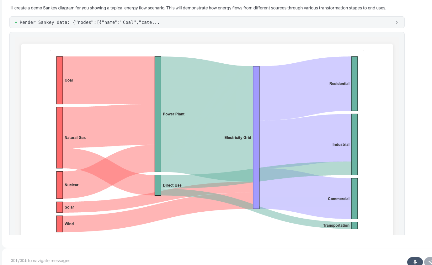
Sankey
Features
- Automatic Detection: goose intelligently chooses the best visualization type for your data
- Interactive Components: All visualizations are interactive with hover effects, zooming, and drilling capabilities
- MCP-UI Integration: Leverages the emerging MCP-UI standard for seamless rendering
- Multiple Chart Support: Can render multiple visualizations in a single response
- Customizable Styling: Supports custom colors, labels, and formatting options
- Export Capability: Visualizations can be saved as HTML files for sharing
Example Usage
In this example, I'll have goose analyze some sales data and automatically visualize it using the Auto Visualiser extension.
goose Prompt
I have quarterly sales data for different product categories. Can you help me understand:
1. The hierarchical breakdown of revenue across our nested product categories
2. How our performance metrics compare across all four quarters
3. The customer flow through our sales funnel process
Here's the data:
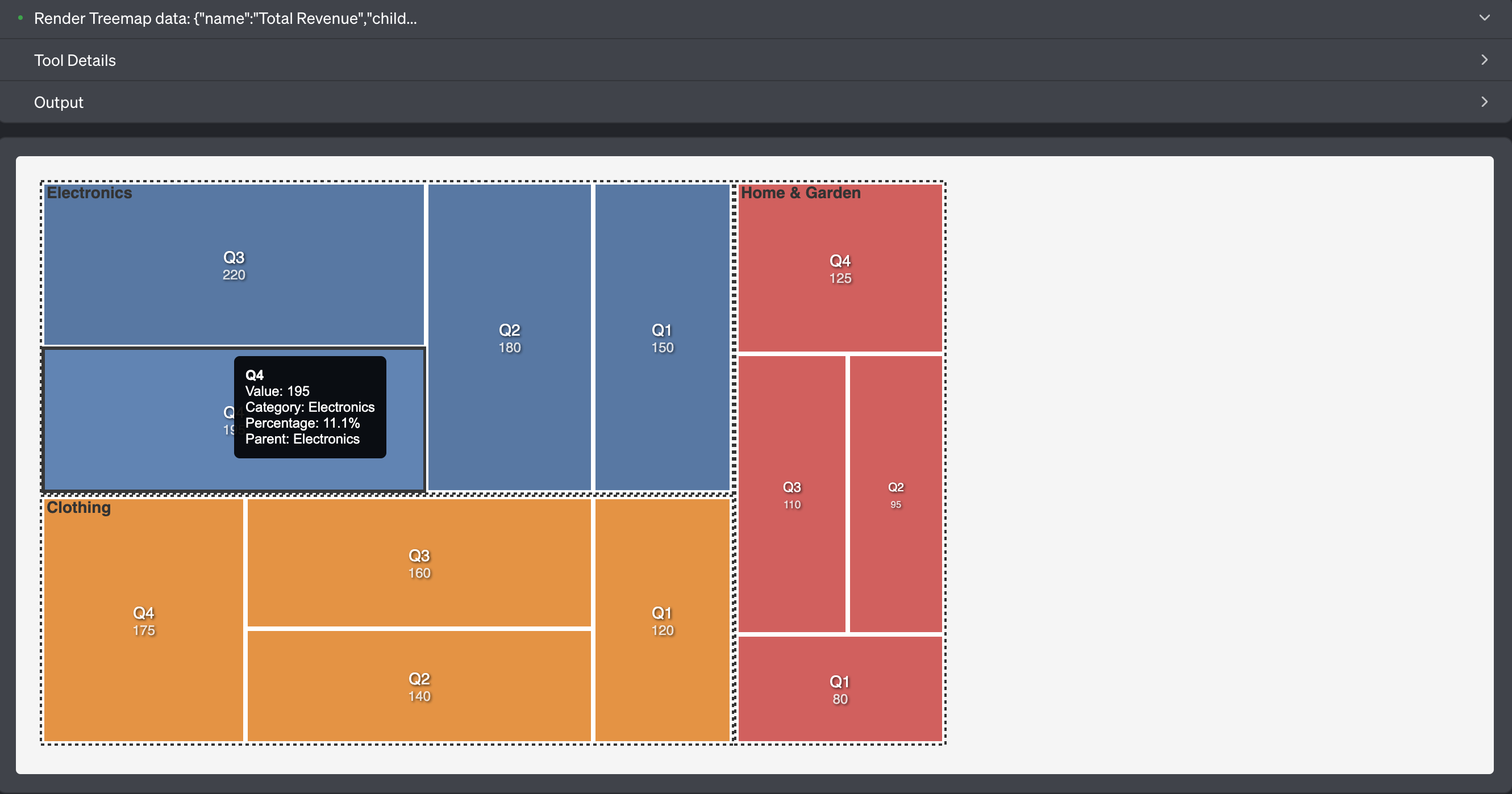
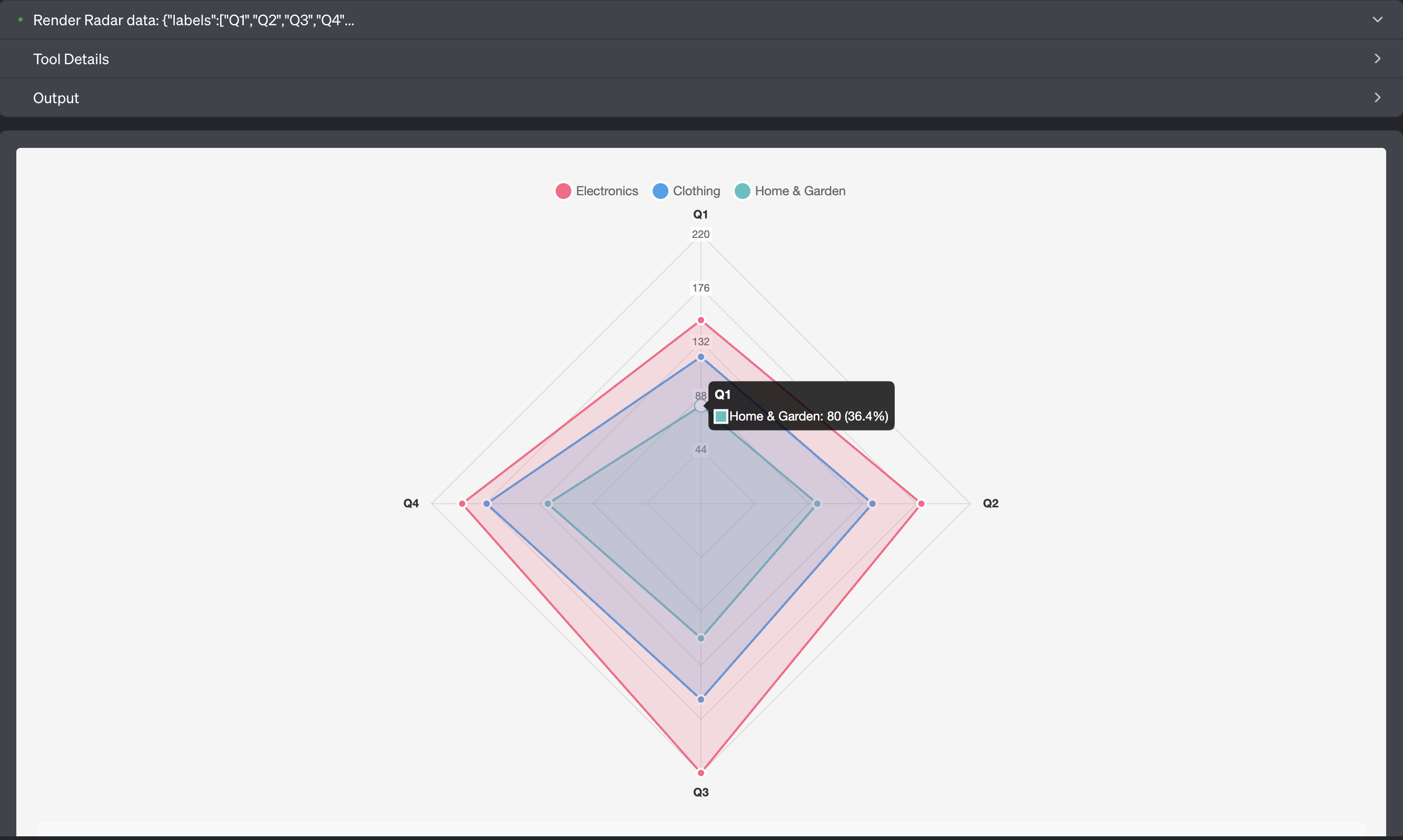
- Electronics: Q1: $150k, Q2: $180k, Q3: $220k, Q4: $195k
- Clothing: Q1: $120k, Q2: $140k, Q3: $160k, Q4: $175k
- Home & Garden: Q1: $80k, Q2: $95k, Q3: $110k, Q4: $125k
goose Output
I'll help you analyze your quarterly sales data with three different visualizations to address each of your questions. Let me create these visualizations for you.
First, let's visualize the hierarchical breakdown of your revenue across product categories:
I've created three comprehensive visualizations to help you understand your quarterly sales data from different perspectives:
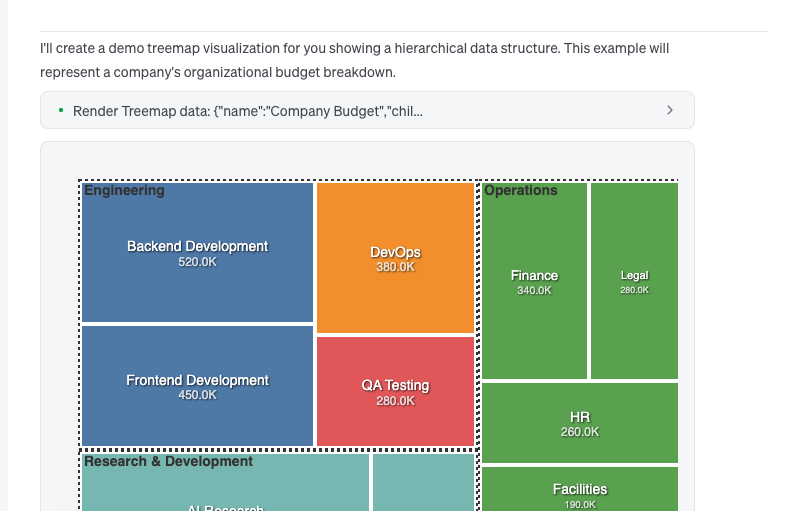
1. Hierarchical Revenue Breakdown (Treemap)
The treemap visualization shows your revenue hierarchy with proportional areas representing the relative size of each category and quarter. Key insights:
- Electronics is your largest revenue generator ($745k total)
- Clothing follows as second largest ($595k total)
- Home & Garden is smallest but growing ($410k total)
- You can see how each quarter contributes within each category
2. Performance Metrics Comparison (Radar Chart)
The radar chart displays how all three product categories performed across the four quarters, making it easy to compare:
- Electronics shows strong Q3 performance ($220k) with slight Q4 decline
- Clothing demonstrates consistent growth throughout the year
- Home & Garden shows steady upward trajectory across all quarters
- All categories show their strongest performance in Q3-Q4
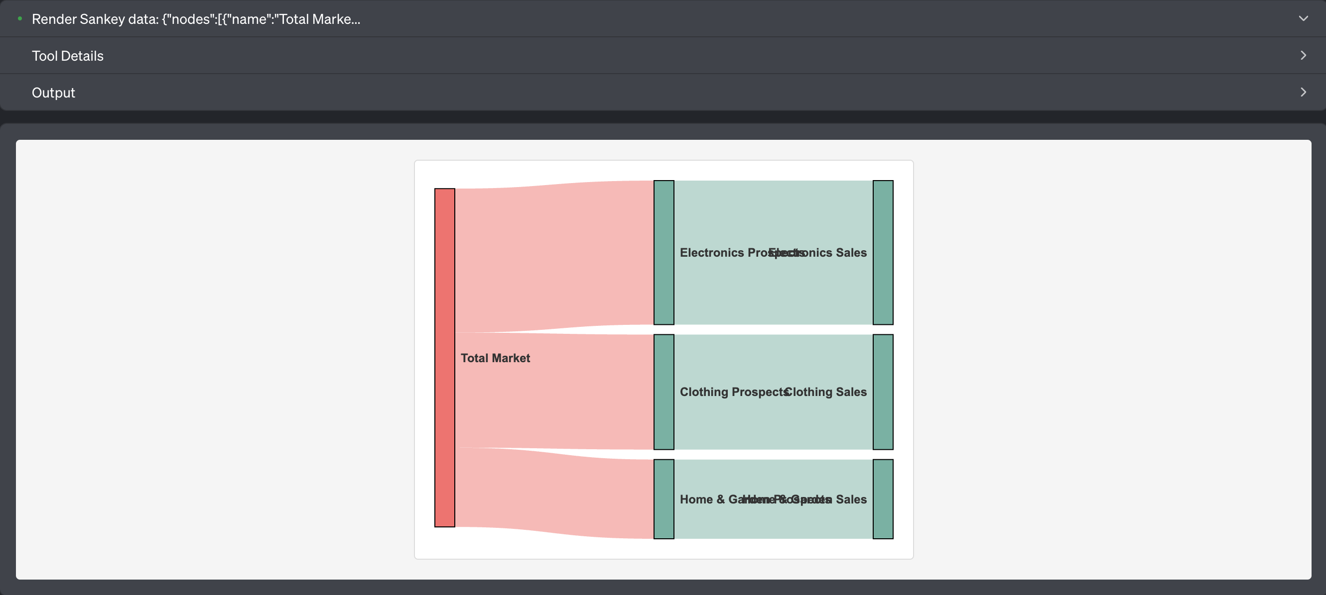
3. Sales Funnel Flow (Sankey Diagram)
The Sankey diagram represents customer flow through your sales process, with flow thickness proportional to revenue:
- Shows how market opportunities flow into prospects for each category
- Demonstrates the conversion from prospects to actual sales
- Electronics has the thickest flow (highest revenue conversion)
- Home & Garden has the thinnest but represents growth opportunity
Key Business Insights:
- Total Revenue: $1.75M across all categories
- Growth Pattern: All categories show positive growth trends
- Category Performance: Electronics (42.6%), Clothing (34%), Home & Garden (23.4%)
- Seasonal Trends: Q3 appears to be your strongest quarter overall
Would you like me to create additional visualizations or dive deeper into any specific aspect of your sales data?
Troubleshooting
-
Visualization not appearing: Ensure the Auto Visualiser extension is enabled and your data follows the expected format.
-
Data format errors: Check that your data structure matches the required schema for the visualization type. The extension provides detailed error messages to guide you.
-
Performance with large datasets: For very large datasets, consider aggregating or sampling your data before visualization.